Descriptive statistics for evaluation
What are descriptive statistics?
Descriptive statistics are a way of summarising large/complex data sets in a way that makes them more understandable. Importantly descriptive statistics do not infer deeper information, such as causal links or reasons that things appear a certain way, they simply present many numbers in a simpler format.
Descriptive statistics include many processes and visualisations that may be familiar from workplace reports, news media, and school maths, such as pie charts, bar graphs, line graphs, averages (mean, median, mode) and ranges.
Why use descriptive statistics?
The primary answer is because otherwise it is nearly impossible to grasp large data sets.
The second reason is equally important though. An implementation evaluation describes what is actually happening so it can be measured against the plan and descriptive statistics are the primary way of doing that for quantitative data. This makes them fundamental to completing an implementation evaluation and provides the basis for any deeper evaluation because you must first know what you are evaluating.
How to use descriptive statistics in evaluation
Descriptive statistics will be used in the implementation evaluation of a service to describe and analyse aspects of the quantitative data that is collected.
1. First know what questions need answering and the data available to answer those questions.
- The evaluation plan, and [TBC documents including KPIs] will have set out the expectations of the service, the questions that correlate to these expectations, and the data to be collected to do so.
2. Prepare the data for use. Depending on the volume of data, the way it is stored, the location of its storage, and the size and structure of the organisation, it may be necessary to create a data output specification for a data manager or analyst to extract the relevant data for use in the evaluation.
3. Consider how the data is best presented to answer the evaluation questions you have. For example, if there is a question regarding the demographics of service users then a pie chart showing the proportions of each demographic could be effective, whereas if you want to show the number of courses that ran quarterly across a 2 year contract then a bar or line graph would be appropriate. Some things can just be presented as a number.
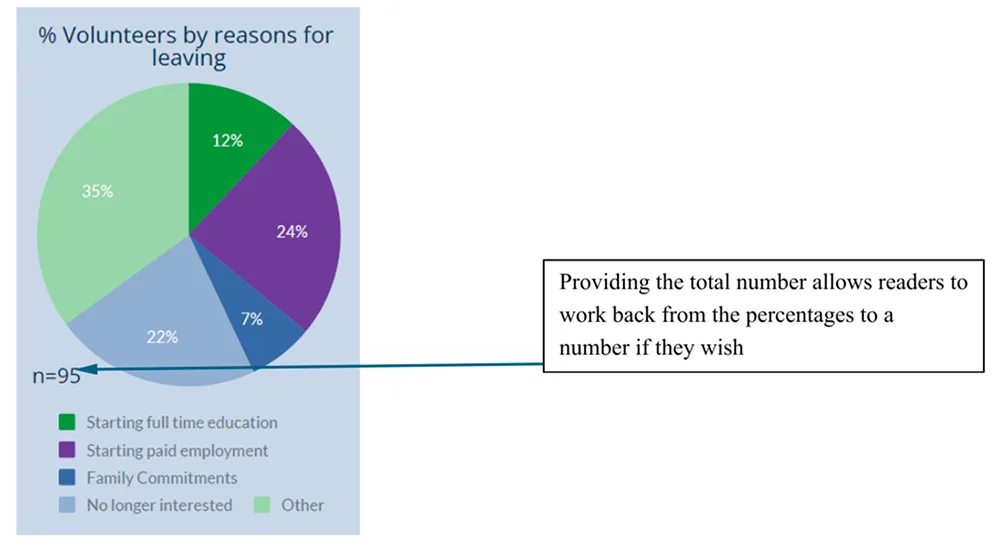
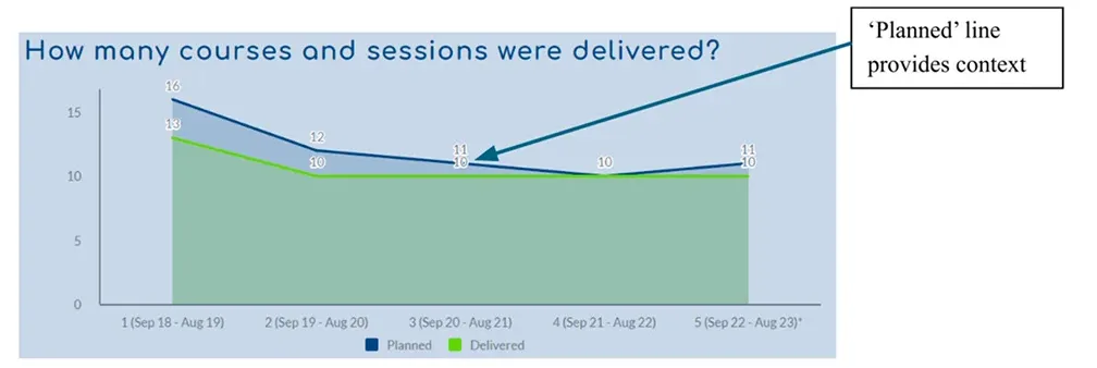
4. Next, think about whether and how the data needs contextualising. For example, it is almost meaningless to provide a graph that shows that between 6-17 courses ran per quarter if the viewer of the graph doesn’t know how many courses the service intended to run. This could be solved by presenting some things as percentages of their target or putting in a second line showing the target number for a given quarter. These are some examples of descriptive statistics we have published (view full reports here):
Family Action Perinatal Support Service Final Report, November 2023
Incredible Years Final Report, October 2023
Breastfeeding Support Final Report, September 2023

HENRY Final Report, December 2024
- Use an appropriate piece of software to take your raw data into a format that can be used to produce descriptive statistics. Microsoft Excel is often an appropriate tool, although if you have particularly large/complex data sets and the skills within your organisation you may need to use tools such as R or SPSS. Google sheets and other software can do similar things to Excel, however it is important to be aware of how and where the data is stored and used, particularly if you are using cloud based software like Google – ensure that whatever you are using is compliant with your data security plans.
- Once you start looking at the data through the lens of descriptive statistics you can start to interpret what it means.
If descriptive statistics are just saying it how it is – why do we need further interpretation?
Although descriptive statistics are a way of ‘saying what you see’, it really matters what is said and the contextual information that is provided around it. In doing evaluation there is a role for the evaluator in interpreting the numbers so they can be understood by those who are not deeply involved in the service or who are first encountering it in the evaluation.
Is that a big number?
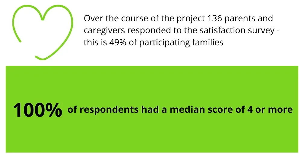
When presented with a stand-alone number, or even a graph, without context it can be hard to tell whether a number is ‘big’, both whether it is a lot or a little and whether it is big in terms of importance. Consider this:
80% of participants on the course found the content useful to their work
or
4 people said they found the content useful to their work
These two statements could both be about exactly the same number, but they give very different impressions of the size and importance of the number.
Here is an example from our own reports that shows how providing context for size and importance matters:
Cooking for a Better Start Final Report, December 2023
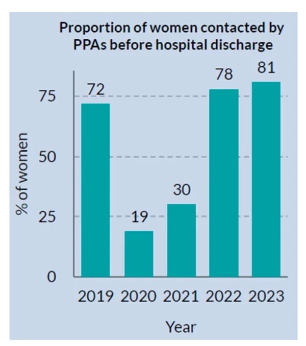
Why is that the number?
Although descriptive statics do not on their own provide reasons for why things are as they are or provide causal evidence, evaluators can legitimately use their knowledge of events to provide context for a number – here is a very obvious example from the same report:
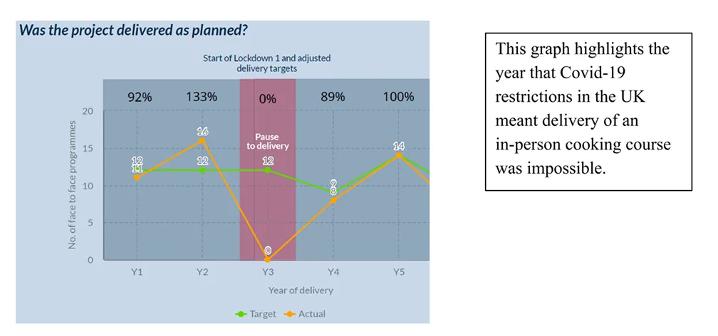
This graph highlights the year that Covid-19 restrictions in the UK mean delivery of an in-person cooking course was impossible.
Context like this doesn’t have to be limited to graphs and charts, descriptive statistics can and should come with written/spoken explanations:

Joining the dots
Sometimes it may be appropriate to show one statistic in the context of another, but it is important not to claim causal links and to be cautious of what connections may be inferred. For example, it would be reasonable to present number of caseworkers employed, alongside number of contact hours clients received, but vital to also state that the statistics do not prove that increasing the number of caseworkers increases the client contact hours (perhaps there is one caseworker who is working many more hours than another), although the relationship may be evidenced in other ways – such as through qualitative interviews with staff.
Another way of connecting descriptive statistics is to show one statistic broken down by another statistic. Here is an example of linking a request for a particular service element (an interpreter), to the way in which that person proceeded through or left the service. This is pertinent and valuable to understanding how the service may be made more inclusive and accessible to those who need it.
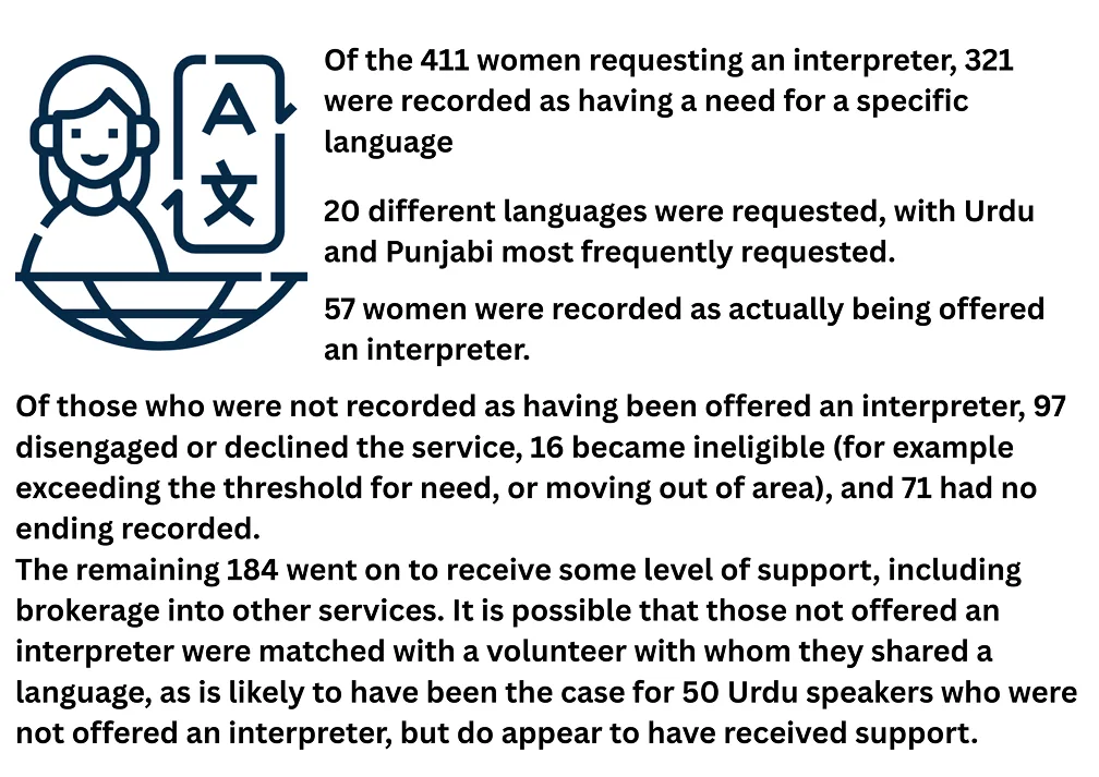
Family Action Perinatal Support Service Final Report, November 2024
Findings and Recommendations
A key element of interpretation will be writing some findings and recommendations, there is more detail on this in producing outputs, but here are some basic starting points:
Findings
- If you are doing an implementation evaluation, then the most fundamental finding is whether and to what extent the service is running as planned, so comment on how closely the actual numbers match the target numbers. This may be RAG rated
- You can also find out things about the data itself and the process of gathering and storing it – this is important to your ability to evaluate so make a comment on the data quality and whether it was sufficient. Are there areas that you have found where more data would provide useful insights?
- Is anything a surprise or unusual?
- What is going particularly well or badly?
- Does the service seem acceptable to and meet the needs of the community?
Recommendations
- Make each recommendation actionable and time bound
- Link each recommendation to a finding
- Recommendations may be about small changes or be about the future of the service as a whole
- Recommendations can be about the data as well as the service
- Recommendations can be about the prospects for evaluation or areas that would be suited to further or different kinds of investigation